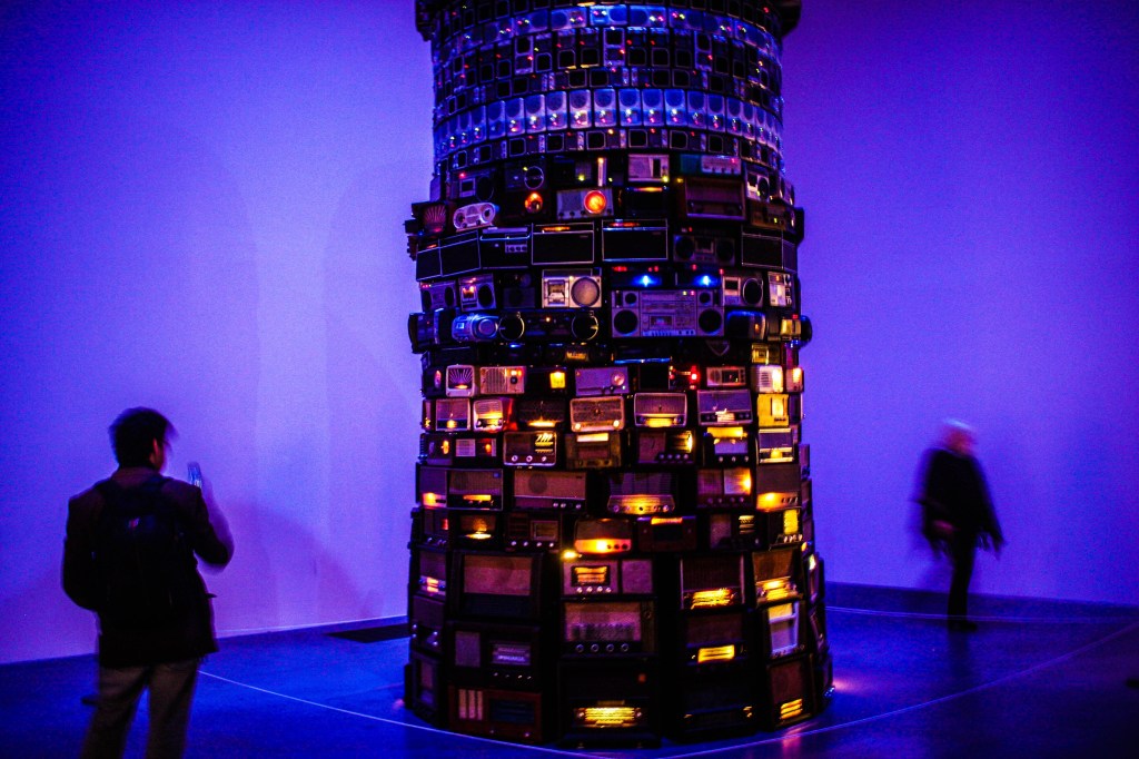
In the summer I visited the Tate Modern, London and saw ‘Babel’ by Cildo Meireles. His installation creates a critical mass of vintage radios standing at over 4 metres tall; towering over the individual.
The circular tower is made of hundreds of second-hand radios that Meireles collected over a period of 11 years. Meireles had the first idea for the piece in 1990 in New York on Canal Street. Meireles had the idea ‘upon observing the quantity and diversity of radios and all the different types of sound objects that were sold around Canal Street’. Miereles has said that ‘Radios are interesting because they are physically similar and at the same time each radio is unique’. It wasn’t until he was Helsinki in 2001 that Meireles finally finished the installation where it was subsequently displayed at the Kiasma Museum of Contemporary Art.
Cildo Meireles
Cildo Meireles is a Rio De Janeiro-born Brazilian contemporary and conceptual artist. Born in 1948 Meireles started his art career in 1963 when he studied at the District Federal Cultural Foundation in Brasilia.
Meireles is best known for his installations which often create a phenomenological experience through viewer interaction.
Many of Meireles works’ have been used to express resistance to political oppression in Brazil.
Meireles refers to Babel as a ‘tower of incomprehension’. Each analogue radio is tuned into a different station, adjusted to the minimum audible volume. The result is a hum of indistinguishable voices, noises and music. The radios compete with each other to create a continuous stream of sound.
The tower has been linked to the ‘biblical story of a tower tall enough to reach the heavens, which, offending God, caused him to make the builders speak in different tongues’.
Babel is placed in a blue-lit room to add to the eerie nature of Meireles piece and enhancing the phenomenological experience of the installation. Larger radios, that are almost furniture in their own right, have been placed at the bottom of the tower. As you progress up the tower the radios get smaller. This was a deliberate decision by Meireles to create the illusion of the perspectival foreshortening.
The curator and writer Moacir dos Anjos suggests that the presentation of informational overload in Babel can be seen as a metaphor ‘for the intricate relations between distinct nations and communities’ which insists on ‘recognising the existence of a territory with uncertain boundaries, one that accommodates multiple oppositions and produces the multiple contamination of cultural expressions previously separated by geographical and historical injunctions’
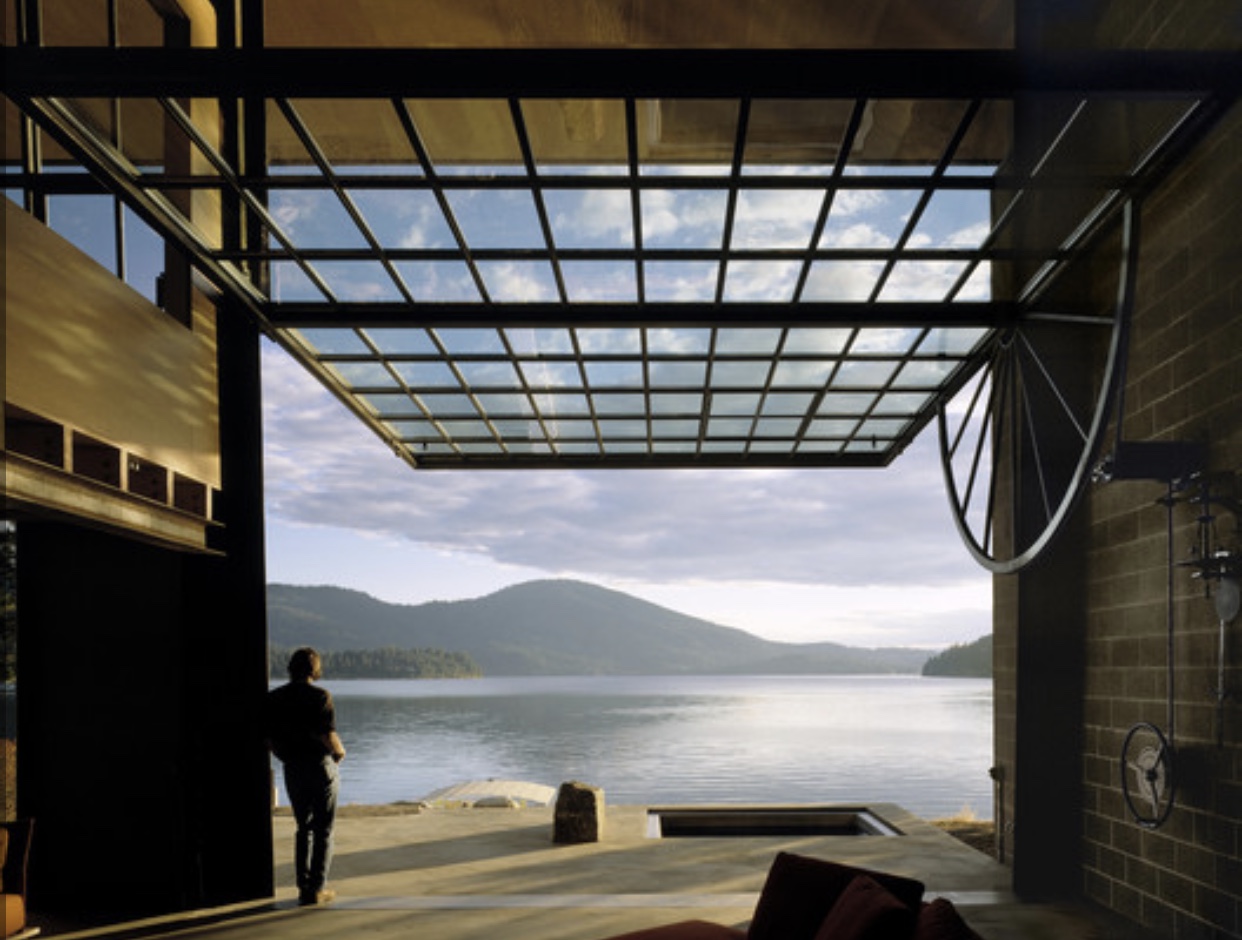
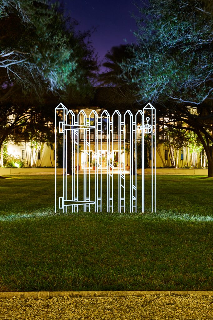
In my design I’ve been looking at different types of kinetic architecture, Olson Kundig’s Chicken Point Cabin is an example of a kinetic facade. The building consists of one large glass facade that when a wheel is turned, the facade rotates and opens out onto the lake. I am very interested in how mechanics can be incorporated into architecture and used in different ways to create unique spaces. For my design I am having three seperate moving platforms which will be able to move to create different levels for different uses.
“Radical art – and I’ve always thought of myself as radical – is always at the frontiers, always speculative, always too radical to be really understood initially. It changes your frame of reference. That’s what Duchamp did.” – Michael Craig-Martin
EDUCATION
Michael Craig Martin
Although born in Dublin, Ireland Craig Martin grew up and was educated in the United States from the age of 5. In 1963 he attended School of Visual Arts in New York obtaining a BA in fine art. Craig-Martin then went on to complete a Masters in fine art (MFA) at the Yale University School of Art and Architecture. On completing his studies in 1966 Craig-Martin moved to London where he has continued to live for the past 50 years.
“I started making drawings of ordinary objects, one at a time, in 1977. I drew them on A4 paper with a pencil and then traced them in very fine tape onto acetate to remove all trace of their being handmade. I had no idea where they might take me, and it would have been inconceivable to me that they would remain at the center of my work to this day. I intended them to be “styleless”, but over the years the way they look has come to be recognizable as my style.” —Michael Craig-
Craig-Martin’s signature style
AWARDS AND ACHIEVEMENTS
In 1989 Craig-Martin was appointed artist trustee of the Tate Gallery, London. In 1997 Craig-Martin represented Britain in the 23 rd Sao Paulo Biennal. In 2001 Craig-Martin was appointed with a CBE. In 2006 Craig-Martin was elected as a member of the Royal Academy of Arts, London (RA) In 2016 Craig-Martin was awarded a knighthood for his services to art
HIS WORK AND INSPIRATION
Through his observational
drawings of everyday, mundane, objects Craig-Martin has created a record of
technological innovation and the transience of this. In his earlier works
Craig-Martin captures analogue processes which transcend into digital
technologies through his body of work. Within his work Craig-Martin explores
ideas of form and function and the relationship between objects, images,
symbols and pictures.
Craig-Martin uses perspective in his line drawings to suggest depth and a three dimensional effect to what is essentially flat, two dimensional, work. A few of the many mediums Craig-Martin uses include painting, sculpture, installations, computer works and drawings. Craig-Martin has also recently moved into more digital works such as a digital colour changing lightbulb which changes colour using software algorithms. Craig-Martin has been using computer technology to simplify his drawings to make them as artificial as possible. He designs his drawings digitally then creates them using paint rollers and thin tape.
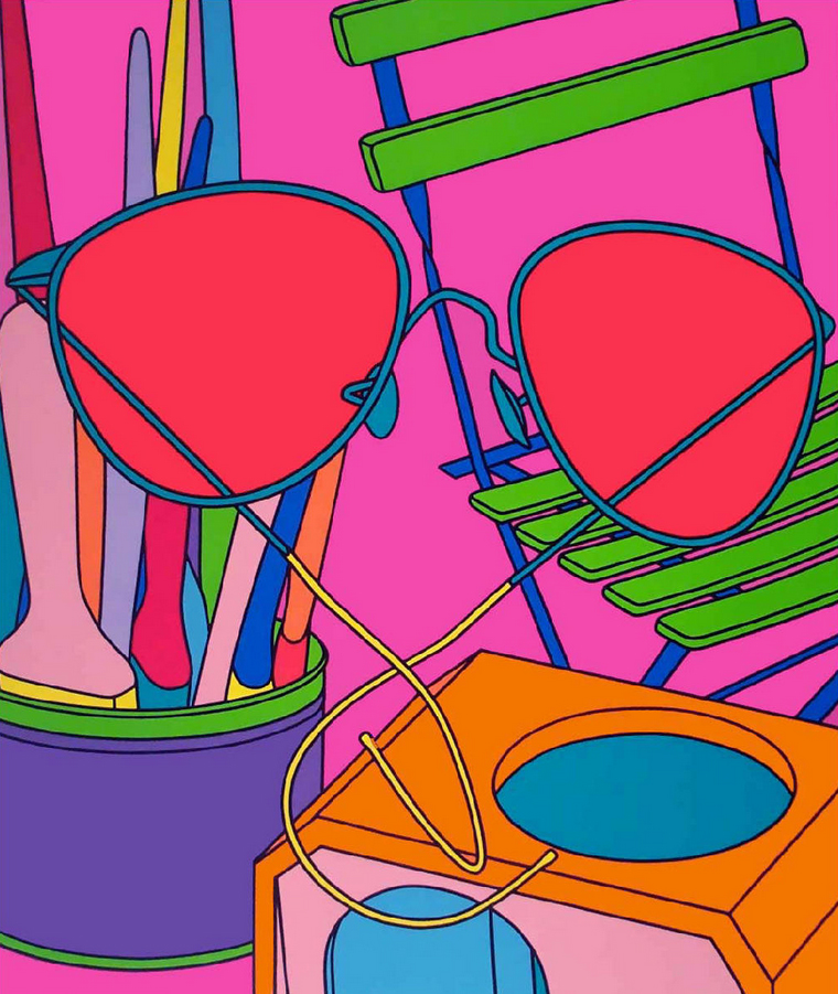
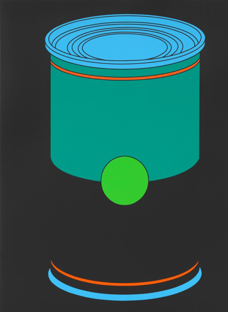
With his bold use of colour it is not surprising that Craig- Martin has taken inspiration from pop artists like Andy Warhol who he paid homage to in his piece ‘Untitled (Soupcan profile)’ in 2013. However it wasn’t until the 1990’s that Craig-Martin developed his hallmark style with his iconic tape drawings.
Untitled (soupcan profile)
An Oak Tree
‘An oak tree’, 1973 is one of Craig-Martin’s most iconic works. Although one of his earlier works, and not typical of his well- known style of work, this piece is considered one of Craig-Martin’s best works. This conceptual piece is simply a glass of water that Craig-Martin claims to have changed into an oak tree. Craig-Martin has explained the thought process behind this piece saying “I was trying to work out what was the essence of a work of art. I thought it had to do with suspension of disbelief. You get it in theatre – why not in art?”
EARLY WORK
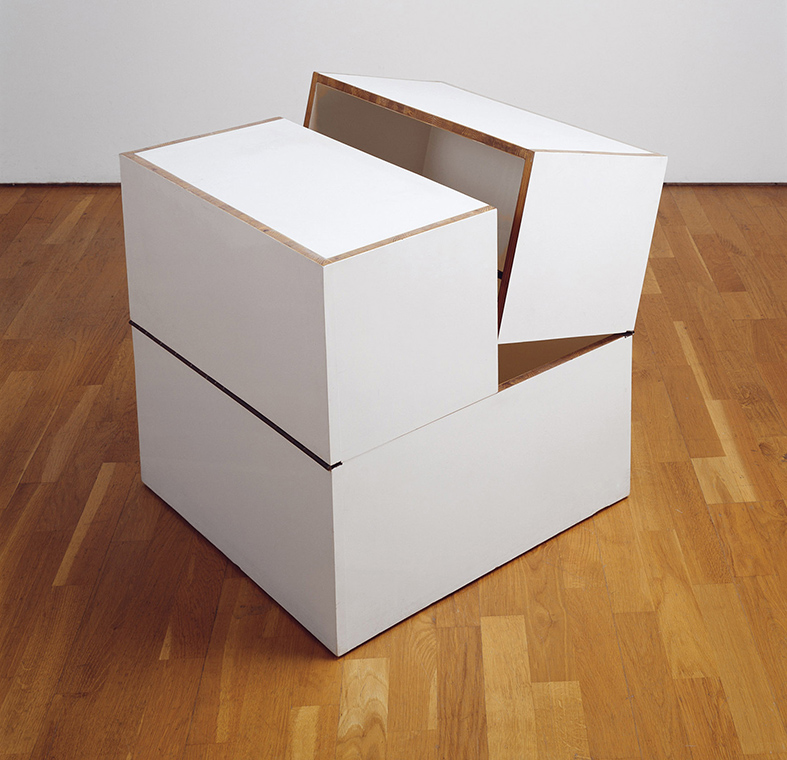
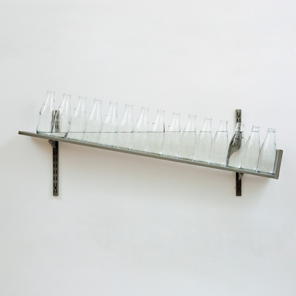
Craig-Martin’s early work explored and questioned the nature of art and representation through a number of mediums. These works are quite simplistic; taking inspiration from American minimalism. These pieces strongly contrast Craig-Martin’s later boldly coloured paintings. However, some of Craig-Martin’s earlier pieces are considered his best works. These include works such as the 1967 work ‘The box that never closes’. Another is ‘On the shelf’ which is an angled shelf featuring fifteen milk bottles which are filled with water which forms a straight level.
The box that never closes.
On the shelf.
My installations question the nature of picture making. Instead of looking at a painting, it feels like you are stepping inside it. All the images are sucked in onto the canvas and then exhaled on the wall opposite. —Michael Craig-Martin
RECENT WORK
Craig-Martin’s recent solo exhibitions include the Museum Haus Esters in Germany in 2013 and his 2012 exhibition at the Rugby Art Gallery and Museum in Zurich. As of late Craig-Martin has started a new body of work which is inspired by iconic modernist architecture of the 20 the century; the likes of which include the work of Mies van der Rohe and Le Corbusier.
TEACHING CAREER
Craig-Martin is recognised within the teaching industry as a prolific and influential art teacher. Starting his teaching career upon moving to London in 1966 Craig-Martin lectured at Bath Academy of Art and Canterbury College of Art. However, he is best recognised for his work at Goldsmiths College, London. He worked at Goldsmith’s for two periods; 1974 to 1988 and 1994 to 2000. During his second stint at Goldsmiths Craig-Martin was appointed Milliard Professor of Fine Arts. Throughout his teaching career Craig Martin is known to have tutored high profile artists such as Damien Hirst, Gary Hume, Tracy Emin and Sarah Lucas. These artists are commonly referred to as the Young British Artists (YBAs) because of their significant and influential role in the art scene in the 90’s. When asked about his role in the YBAs careers’ Craig-Martin said that ‘They also knew they couldn’t do what lots of artists have done – go on the dole. There was no dole. They knew the only way to survive was through their work. They had a sense that there was somebody out there to speak to, and started to work with the idea of an audience before there was an audience.” Craig-Martin has also published multiple publications including his memoir ‘On being an Artist’ which acts as a inspiration for aspiring artists.
IMPORTANT AND RECENT EXHIBITIONS
Craig-Martin’s first
solo exhibition was at the Rowan Gallery in London in 1969.
In 1972
Craig-Martin posed work in a collective exhibition of British conceptual art,
entitled ‘the new art’, at the Hayward Gallery.
In 1989 there was a retrospective of Craig-Martin’s work at the Whitehall Art Gallery. This was followed by two other retrospectives at the museum of Modern Art Dublin in 2006 and at the Serpentine gallery, London, in 2015.
In 1995 Craig-Martin curated his own exhibition entitled ‘Drawing the Line’ which toured a number of galleries.
“I was interested in how form followed function. Take a bucket: it can’t be twice the size it is because if you filled it up, it would be too heavy to carry. The handle is in a certain place because if it was bigger, the side would hit your leg”
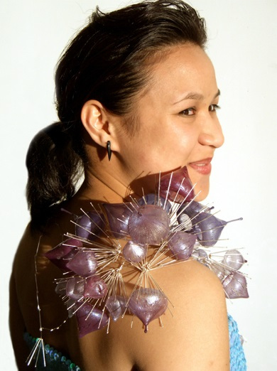
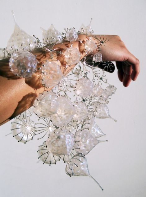
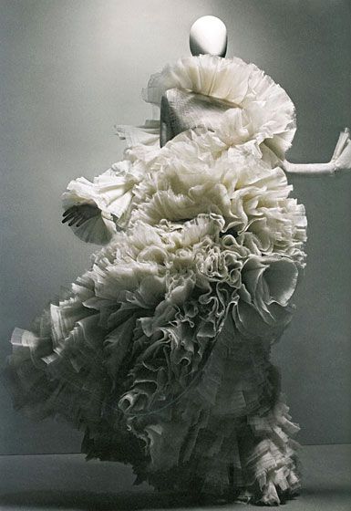
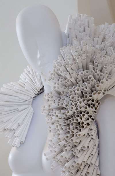
Below are precedents that I have been looking at as part of my research into wearable art/architecture; wearable pieces that change the spatial field in which they sit.
Bioplastics – an environmentally friendly alternative to traditional petro-plastics. I will be exploring the potential of bioplastic and how it could be used in art and architecture.
There are 3 different types of ‘environmentally friendly’ plastics that are refered to as bioplastics:
BIODEGRADABLE PLASTIC – these are plastics made from traditional petrochemicals but they are engineered to decompose faster.
ECO/RECYCLED PLASTIC – made from recycled plastic materials instead of raw petrochemicals
BIOPLASTIC – made from natural materials like corn (this is what I will be focusing with)
40% of plastic produced globally is single-use
It is more important now then ever before that we find an alternative to the oil-based plastics that are polluting are planet.
Bioplastics offer endless opportunities to replace petro-plastics. Bioplastics are made from materials found naturally and so they are better for the environment. Bioplastics can typically decompose in soil or landfill within a few months; a small fraction of the time it takes petro-plastic to decompose. Bioplastics can be made from waste materials like hair, potatoes that aren’t edible, seaweed etc. This means that we could reduce our waste and create an alternative to petro-plastic at the same time.
Bioplastics could also be used to provide us with vitamins and nutrients by bio-engineering. We could soon survive solely off enginered bioplastic.
Sounds perfect – what’s the catch?
Starch-based bioplastics are often made from maize and corn and there are concerns that land previously used for growing food is now being used to ‘grow plastics’. By 2014 almost a quarter of US grain production was expected to have been turned over to biofuels.
Increased production of biofuels could lead to rising food costs and increasing poverty.
Growing crops for bioplastics still uses crude oil based products to power farming machinery. Intensive agriculture also adds to greenhouse gas emissions and there can be water pollution from the use of fertilisers. So, bioplastics are not quite as green as they may seem.
According to explainthatstuff.com ‘In some cases, these indirect impacts from “growing” bioplastics are greater than if we simply made plastics from petroleum in the first place’.
Extracting the starch from the plant and converting it into plastic is also highly energy intensive process. A starch-based plastic bag can often end up being more energy intensive and cause higher emissions than an oil-based bag.
Recycling and disposing of bioplastics can also be an issue; bioplastic cannot be recycled alongside normal plastic. If recycled together the bioplastic will make the other plastic unrecyclable as the end product will be chemically unstable.
However, bioplastics are still a more environmentally friendly option when compared with normal plastic as they can decompose in a few months in landfill or a compost bin.
Switching to bioplastics – A case study
Seasonaly the National Trust sends out magazines to their 5 million members, typically wrapped in a polywrap packaging. Recently the National Trust switched to a potato-based bioplastic wrapper in order to cut down on their environmental impact. The new wrapper can be put into the compost bin where it will decompose within a few months, compared to oil-based plastic which can take up to 500 years to decompose in landfill.
The National Trust are leading the way for corporate organisations by cutting down, and eventually eradicating their use of single-use plastics. This is an important issue as 40% of plastic produced globally is single-use; only used once before being thrown away.
The potential applications of bioplastic
Maria Veropoulou
Designed by architect Maria Vergopoulou this concept for self-build microhomes would enable people to grow their own homes. The pod-like homes would be made from thin bioplastic layers.
Maria Vergopoulou
Bioplastic chair
Designed by Iratzoki Lizaso, these chairs are the first on the market to be manufacture using bioplastic.
Cotton and Corn trainers
These Reebok trainers were launched in August 2018 as part of a sustainability initiative called ‘Cotton and Corn’. The trainers have a corn-based bioplastic sole, an alternative to the petroleum-based rubber-soles typically used in trainers. 75% of the shoe is classed as bio-based content.
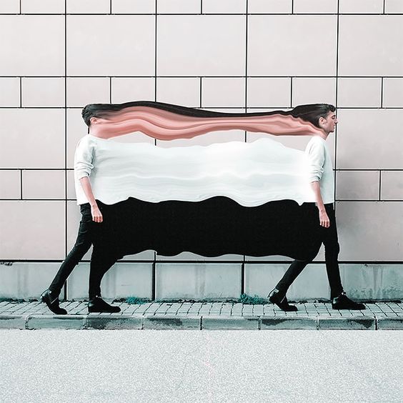
UNITY – It’s all about creating a sense of harmony, with no particular object distracting you from the whole.
Unity can be achieved by using the same/similar shapes, distributing colours evenly, repetition of the same object.
There are two types of unity; unity with variation and unity without variation.
Unity with variation
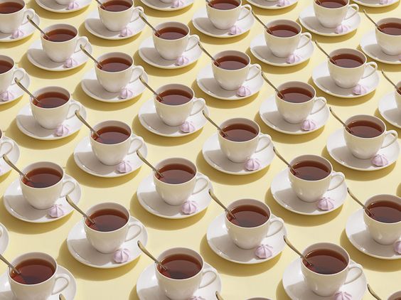
Unity with variation: different pictures of lips. Unity is created because they are all lips
Unity without variation
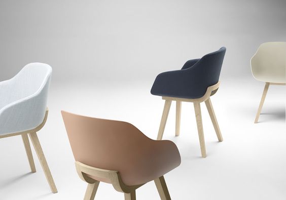
Unity with variation: repetition of the same object
BALANCE
There are two ways of creating balance, either through symmetry or asymmetry.
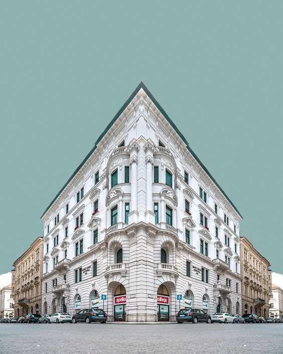
Symmetry – creates stillness or a sense of calm
Symmetry
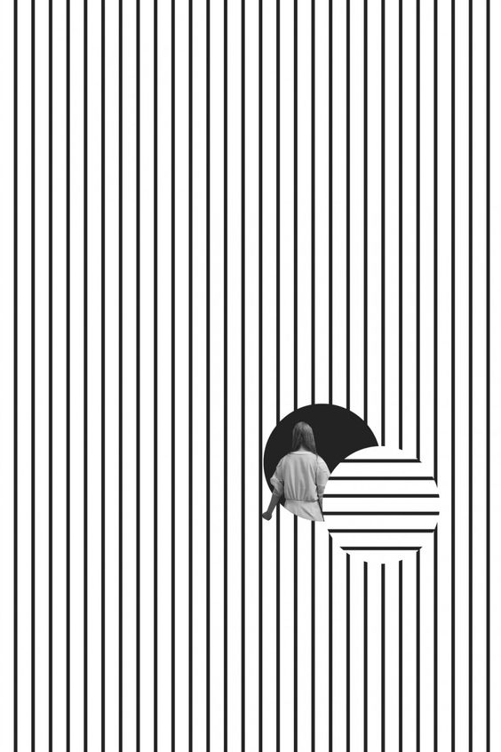
Asymmetry – creates tension or movement
Asymmetry : rotation of the lines and the placement on one side of the composition
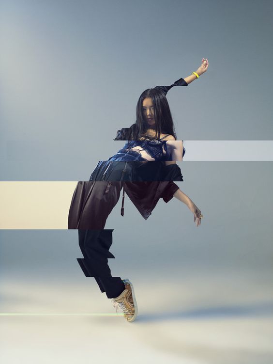
MOVEMENT
Movement can be created by placing objects in suspended animation to create the illusion of movement.
Movement
Movement
RHYTHM
Rhythm can be created through the placement of objects in a composition. By altering the distance of objects you can change the rhythm.
Rhythm: the equal placement of the girl creates a steady rhythm
FOCUS – creating a main focus or point of interest in the collage.
There are different ways of achieving a focal point, including:
Isolating an element
One object differs from all the others
Difference in colour e.g. muted/bright
Difference in size
Meeting of lines
Focus: meeting of lines.
Focus: isolation of the design through change in colour
CONTRAST – difference between objects in the composition
Contrast can be achieved through differences in:
Light/Dark
Colour
Texture
Shape
Contrast: difference in colour saturation of objects.
Contrast: difference in texture and shape
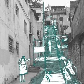
PROPORTION – the size of parts of a whole
Interest can be added to a composition by having unequal parts of a whole.
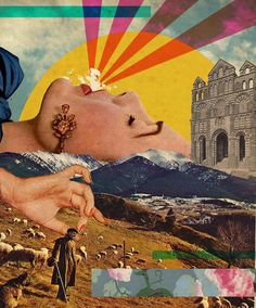
Proportion: the proportion between the head and body is atypical creating an element of suprise.
SCALE – the visual comparison between different elements.
A difference in the size of elements can add interest to a collage.
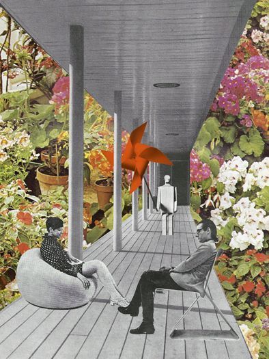
Scale: the scale between the head and the person in the bottom-left is unequal creating interest.
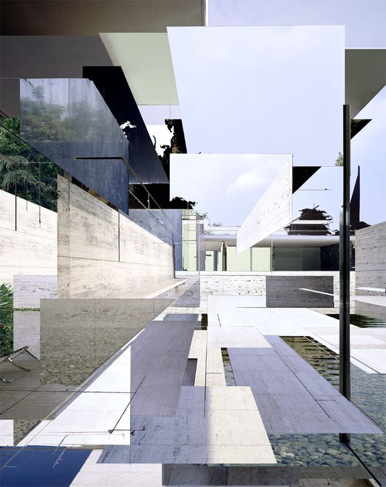
DEPTH – creating the visual illusion of dimensionality to a 2D collage
Creating a depth of field can help bring a collage to life.
Depth can be created by:
The overlapping/layering of objects
Placing foreground/background objects in different parts of the composition
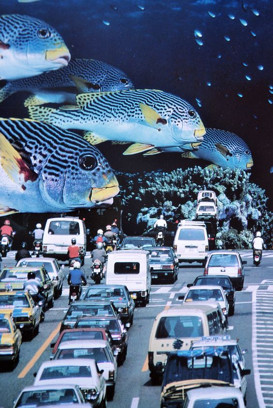
Making foreground objects larger and more vibrant
Increasing the distance between objects in the composition
Depth: a deeper depth of field is created by elongating the distance between the boat in the foreground and the building in the background.
THE RULE OF THIRDS
Possibly the best known rule of composition the rule of thirds is a helpful device to help balance the placement of objects in a composition. The key is to place objects along the lines of intersection.
The rule of thirds: the grid
The rule of thirds: objects have been placed at the intersection of lines
This post is inspired by Hollie Chastain’s book ‘If you can cut you can collage’.